Combining Aesthetics and Usability
The eCommerce behemoth
eCommerce is a well-established and ever-growing industry worth around $2.5 trillion. Over the last ten years, the online shopping experience has improved by leaps and bounds.
Impact of COVID-19
The COVID-19 pandemic saw a rise in online shopping. As physical stores shut, shoppers flocked to the online sphere. According to a survey, the pandemic forever changed online shopping behaviours.
Shifting to the online space
Clothing brands have entire teams dedicated to curating the online shopping experience. In my experience of shopping online, one website has stood out as being a real pain for users.

About the brand
ZARA is a Spanish apparel retailer specialising in fast fashion. With 2,259 ZARA stores in 96 countries, ZARA is a truly global brand, so it is somewhat baffling to find that so many of their customers find their website difficult to use. As part of my course with LoveCircular, I decided to redesign the website for desktop and mobile with the following key goals in mind:
- Increase in sales for all clothing types
- Fewer enquiries to the contact centre
- Encourage referrals to friends and family members
- A functional eCommerce platform that complies with UX methodologies
- Redesign the home page and at least two other pages
I also wanted to retain the branding and feel of ZARA, which, despite being a high-street retailer, has the aesthetics of a much higher-end brand, both in-store and online.
My role
During this case study I took on the role of user researcher, UX designer and UI designer over the course of two weeks.
Research
- Identifying pain points
- Competitor analysis
- User interviews
Identifying Pain Points
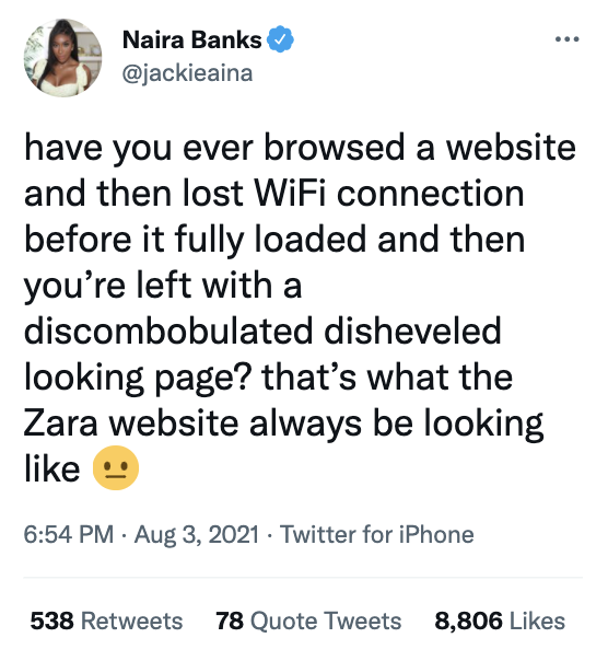
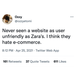
Before starting this case study, I knew from social media and personal conversations that many users find the ZARA website difficult to navigate. This made me keen to take the existing site and make simple changes to improve usability and increase sales. I hadn’t used the site in a while, so I decided to visit it on desktop to try and identify some pain points.
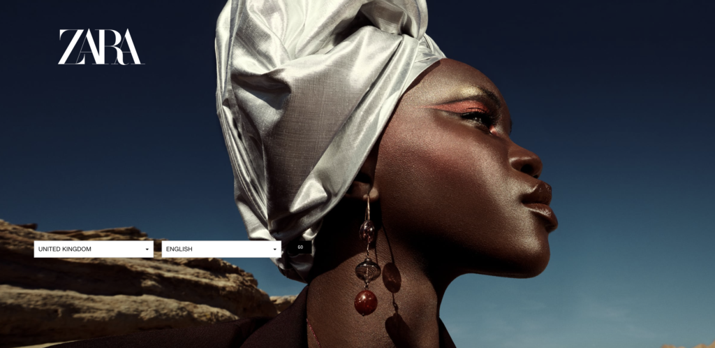
Immediately on loading the landing page, I spotted a major design violation. The drop down lists to choose your country and language were clear enough, but the small black ‘Go’ button to enter the site was hidden away and barely visible in the shadows of the background image. It took me a while to spot it. I don’t have any visual impairments yet I was almost unable to enter the site. This wasn’t a good start.
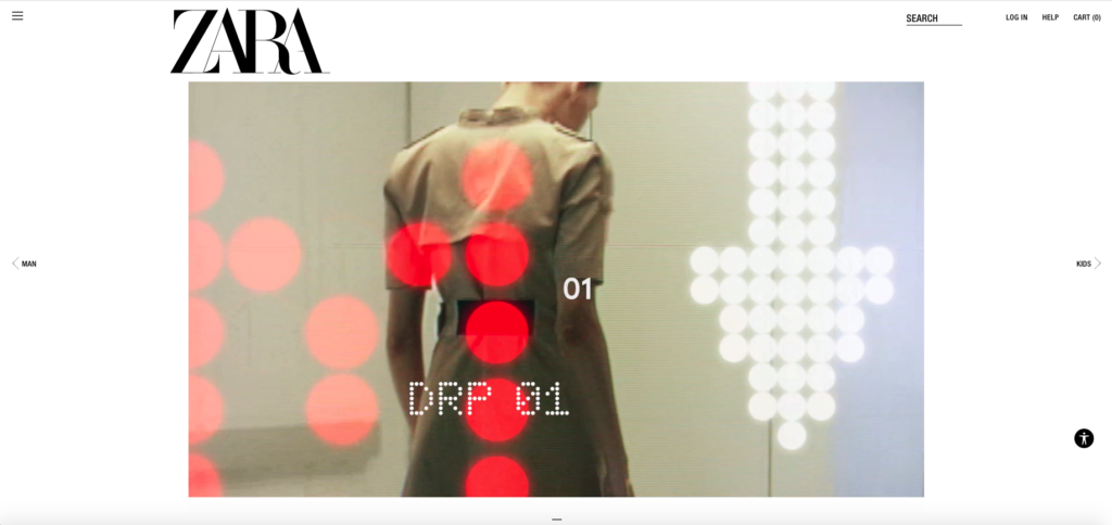
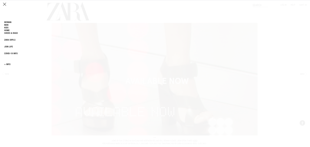
Upon entering the site, you’re met with a clean, minimal homepage with a looped video showcasing ZARA’s latest seasonal collection. The logo, video and search button are the largest and most central elements on screen, while the burger menu, log in, help and cart buttons are relegated to the very edges. The homepage evokes the feeling of a small and minimal art gallery.
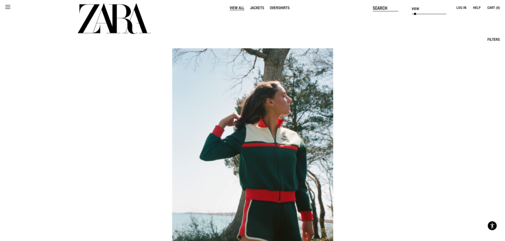
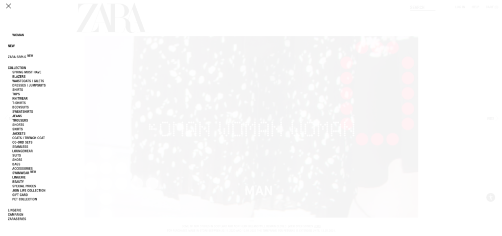
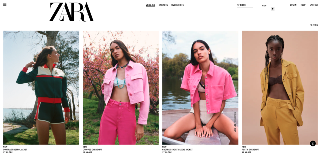
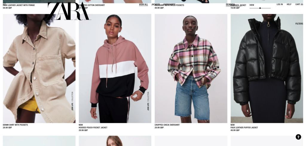
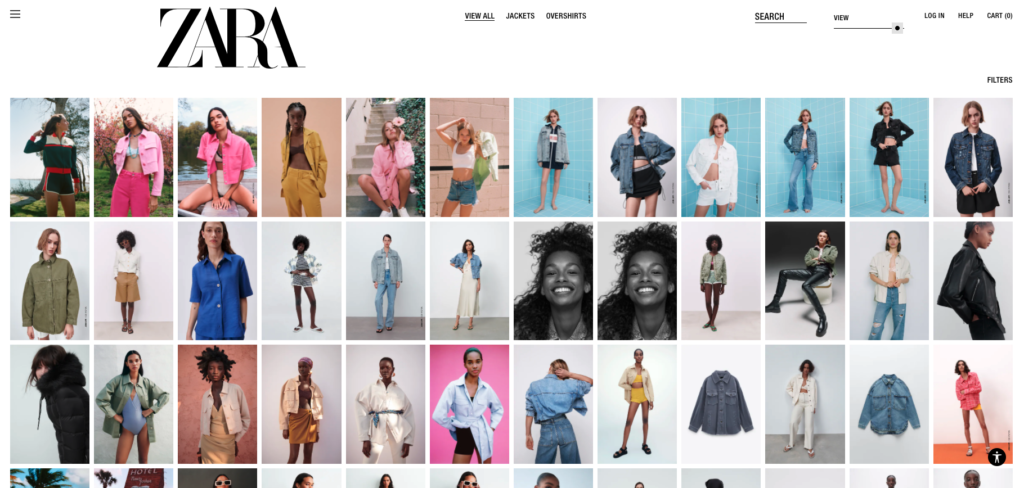
Finding the navigation menu icon in the top left corner of the page, I searched the unordered list they called a menu and clicked through to the ‘jackets’ page. The layout of the browsing page is . . . interesting to say the least. A mix of still images and looped videos, the products are arranged sporadically and in varying sizes, some centred, some to the far right or left, some with extended descriptions and others with the product name and size in tiny font.
There is a slider bar tucked away on the nav bar which can be moved to make the products appear in a more standard layout of four or eight in a row, but this is easily missed. When scrolling down the browsing page, the items on the nav bar slightly obscure the products as it doesn’t have a solid background, so the user must make sure they have scrolled to the correct point on the page before clicking on an item, to ensure they aren’t accidentally taken to another page.
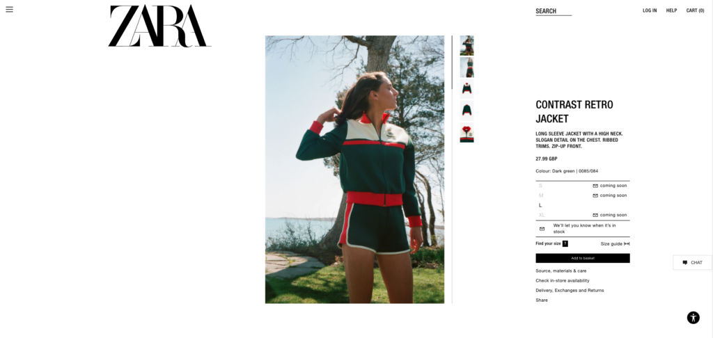
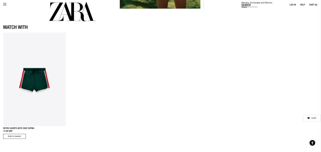
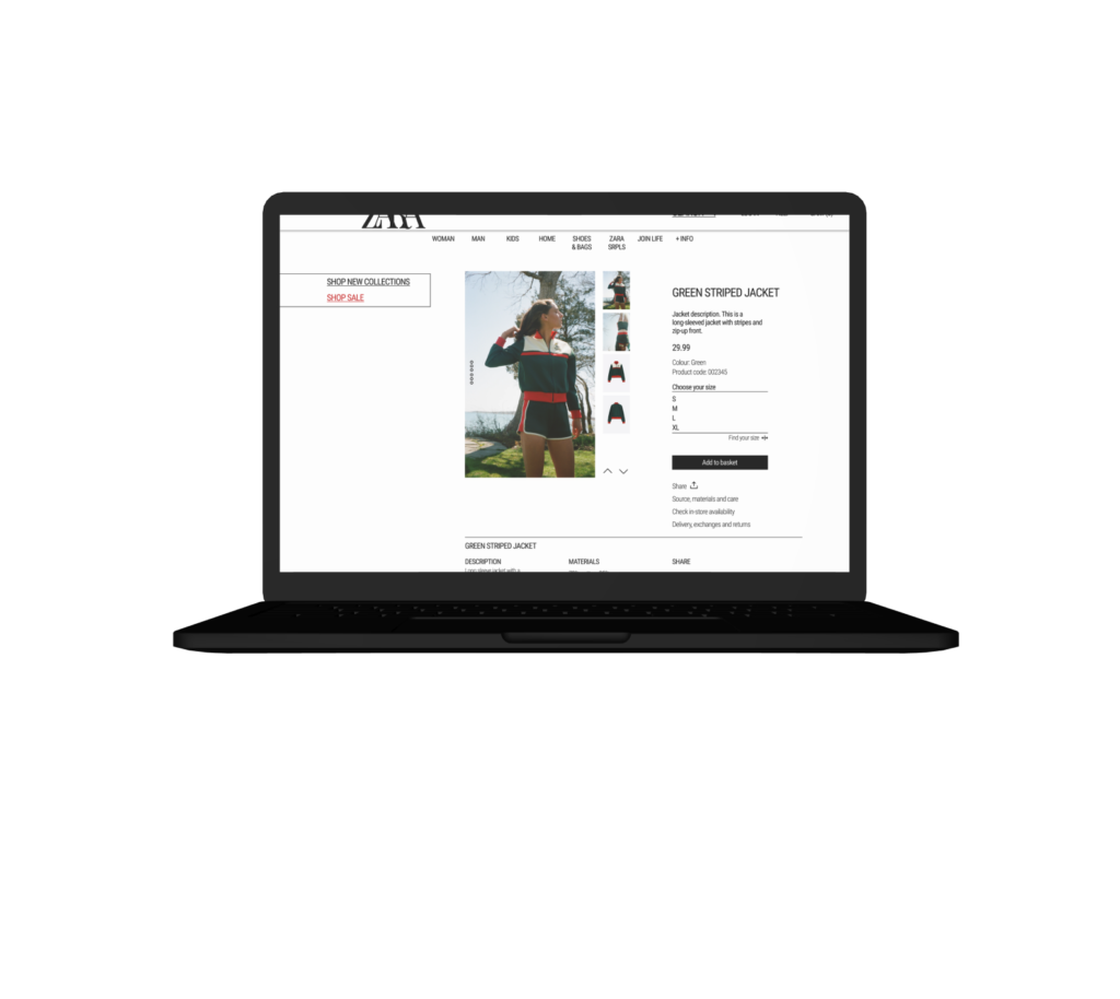
The product page continues the clean look of the rest of the site and is better in terms of usability, though the font size remains small. You can scroll vertically through the product images or click through the column of images to the right. Scrolling down, there are rows of ‘you may also like’ items but you could easily miss that the rows are scrollable, as there are no arrows or scroll bars suggesting there are further items beyond what immediately appears. On a desktop, it’s uncomfortable to click and drag the rows to see the additional items; this bit seems more suited to a touch-screen mobile user.
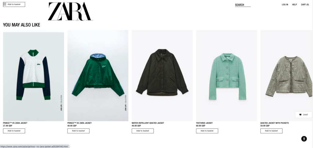
Overall, my assessment showed me that there were many aspects of the ZARA website that could be improved on to make it more user-friendly.
Competitor analysis
The main retailers I identified as direct competitors were also the sites that users said they used the most: ASOS and H&M.
These sites have a mostly female user base made up of 18-40 year olds.
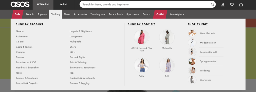
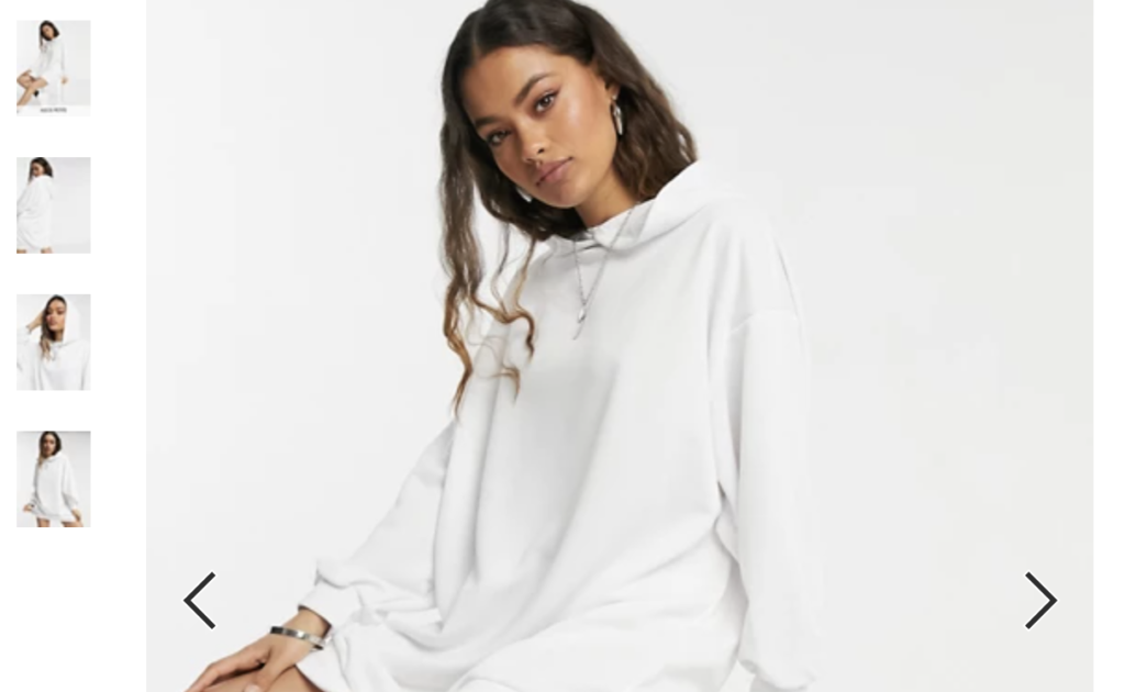
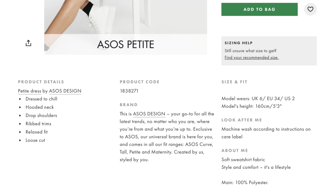
Properties of ASOS:
- Categorised nav menu
- Arrows for scrolling between product images
- Product details above the fold
Properties of H&M:
- Categorised navigation menu
- More filtering options (for both products and results view)
- Dots on images to indicate scrolling ability and direction
- Product info above the fold
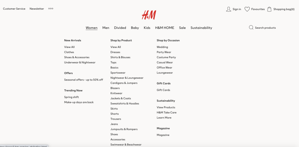
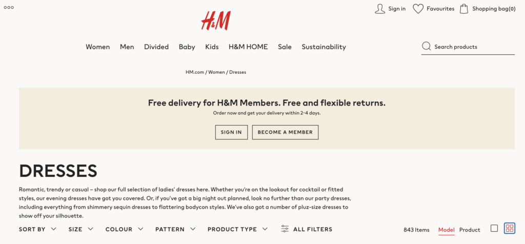
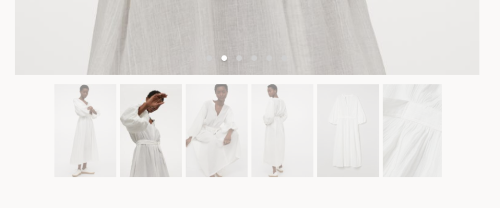
“For a basic high street shop, the ZARA website is too artistic.”
User, 25
User research
For this stage, I decided to set out the main issues I could identify with the site and mould my survey questions around these issues. I planned to ask the interviewees to carry out a set of tasks on the ZARA site, either on their desktop or phone. I combined quantitative and qualitative research in my survey questions rather than separating them out due to time constraints.
Survey questions
Have you used this site before?
a) If yes, how often do you use it on a scale of 1-5, 1 being rarely and 5 being regularly?
Go to zara.com
Enter your country and language and access the site
On a scale of 1-5, 1 being very easy and 5 being very difficult, how easy or difficult did you find it to complete this process?
Navigate to the page where you can browse jackets.
On a scale of 1-5 how easy or difficult did you find it to get to the Jackets page?
Scroll down through the results a bit. Now imagine you want to see more results on the page without having to scroll as much. How would you do this?
On a scale of 1-5 how easy or difficult did you find it to adjust this setting?
Click on any item. Flip through the images.
On a scale of 1-5 how easy or difficult did you find it to flip through the images?
Check what fabric the item is made of.
On a scale of 1-5 how easy or difficult did you find it to check this?
Go back to the item page. Find the ‘You may also like’ section and view all the suggested items. Can you scroll through them all?
On a scale of 1-5 how easy or difficult did you find it to scroll through these images?
Now head over to the Spring Must Have collection page.
Filter the results by price, choosing any.
On a scale of 1-5 how easy or difficult did you find it to filter?
Now go to the page where you can purchase an egift card.
Change the gift card amount to anything you like. On a scale of 1-5 how easy/difficult was it to change the amount?
How did your experience on this website compare to other clothing sites? Was it easier or more difficult to use?
What made it that way?
Do you have any other comments or suggestions?
If you could edit the website, would you keep it the same or would you change it?
What would you change?
The interviewees ranged in age from 20s-50s. Due to time constraints, the gender and ethnic backgrounds of my interviewees were mostly the same, so this is something I would take into account when assessing the limitations of my user research.
Define
Results
- User interviews revealed issues with text size on the site. Almost all complained it was too small.
- Some users did not use the navigation menu as they didn’t realise it was there
- Some users were thrown by the scroll direction on product images
- Many users commented on the fabric detail being tricky to find
- Some users were thrown by the scrolling ability on the suggested items
- Many users did not know how to condense results
Taking these issues into account, my UX decision making will prioritise labelling and clarity of information.
Hypothesis
Over the course of my redesign, I will aim to make the website more accessible, intuitive and usable across pages.
- To make the site readable, I will create a standardised text sheet with corresponding sizes for different types of text.
- I will apply labelling to direct users of all ages to the site’s available elements.
- I will make clearer the scroll direction of different parts of the site by labelling with arrows and adding scroll bars.
- I will add oft-searched-for information above the fold rather than below or within sub menus.
- I will change the copy and placement of personalisation elements on the site to make users aware of the functionalities.
Ideate
- Crazy 8s
- Mind mapping
Ideation
Rather than a complete overhaul of the UX and UI, I knew I wanted to retain the unique feel of ZARA’s site, but include simple changes which would transform the user experience.
I decided to ideate using two techniques: Crazy 8s and Mind Mapping.
Crazy 8s
- Eight sketches
- One minute to sketch each idea
- Aim is to get my ideas down on paper without thinking about technical constraints in order to build the foundation of the design
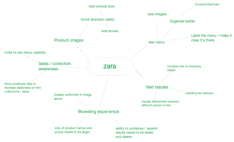
Mind mapping
- Visual representation of all thoughts and concepts
- Focus on high-level ideas without caring too much about the small details
- Keep in mind business needs as well as user insights
Design
- Wireframes
- Final interfaces
- Design principles
Wireframing
My initial low-fidelity wireframes took my Crazy 8s rough sketches into a coherent form. At this stage, I concentrated on the layout and information architecture, i.e.
- Where menu buttons and their labels would go
- What symbols I would add to the existing design
- How I would move around existing elements to make the site more user-friendly
I explored two different forms of the navigation menu: first was an image-based menu which would show some of the latest styles for each category. However, I decided against using this form and stuck with the traditional text-based menu because it lends itself to categorisation more easily.
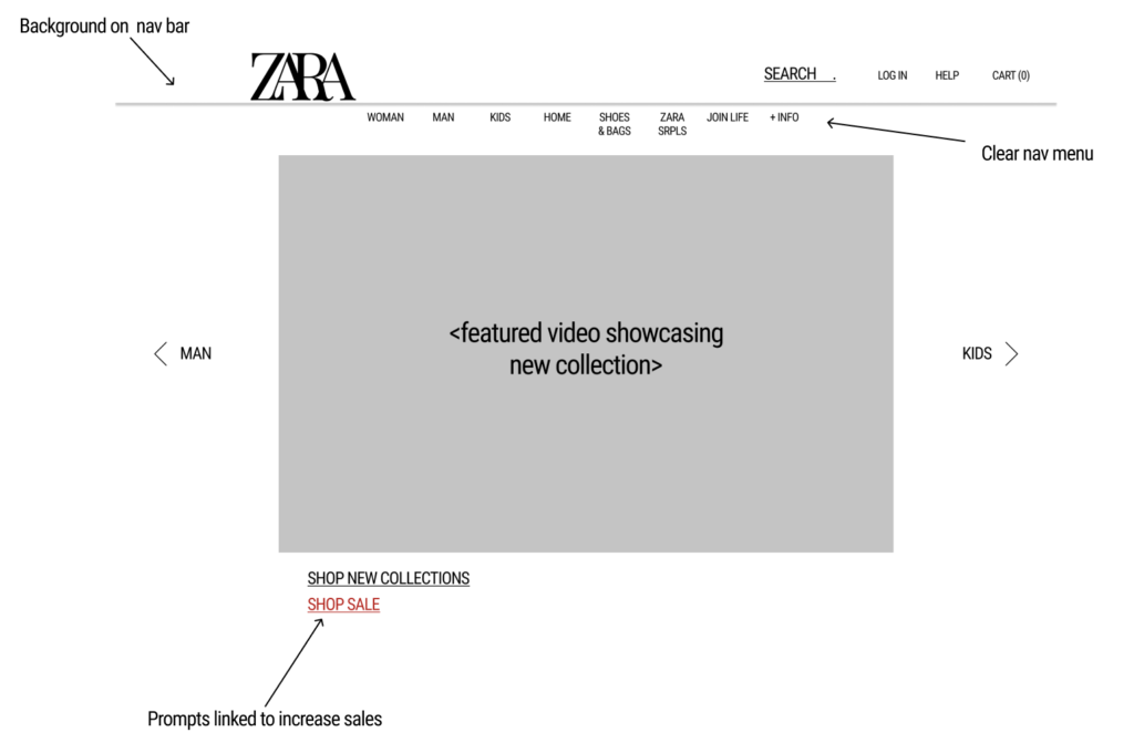
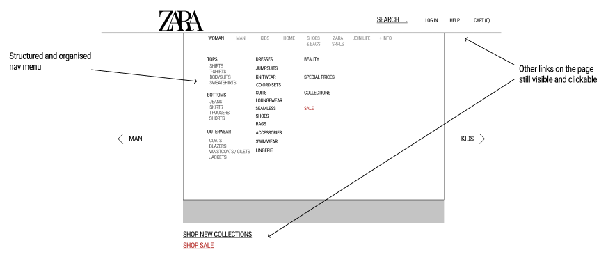
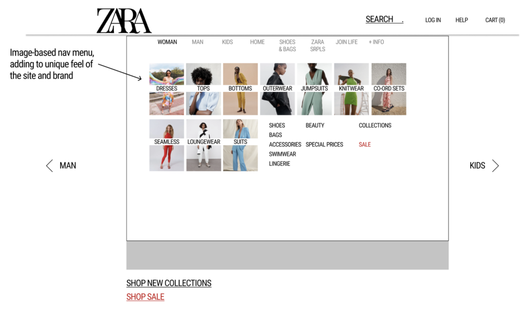
Next came the high-fidelity wireframes. Here, I built on my low-fidelity wireframes to include:
- Details about information architecture
- Navigation menu layout
- Hierarchy of information
- Responsive design to translate all info and features easily from desktop to mobile
Design principles
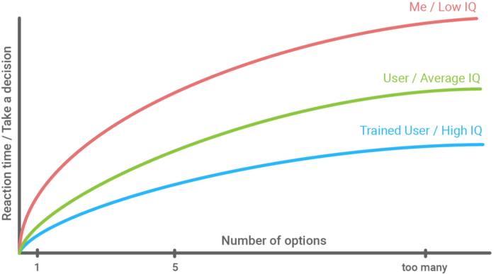
Hick’s law / Law of Proximity
The time it takes to make a decision increases with the number and complexity of choices. Objects that are near, or proximate to each other, tend to be grouped together.
The original nav menu managed to both reduce the number of choices to the point of abstraction and overwhelm users by failing to group long lists into categories.
The navigation menu I redesigned follows these laws by grouping different clothing categories together, thus reducing the number of choices and increasing chances that the user will be able to find what they’re looking for.
Jakob’s law
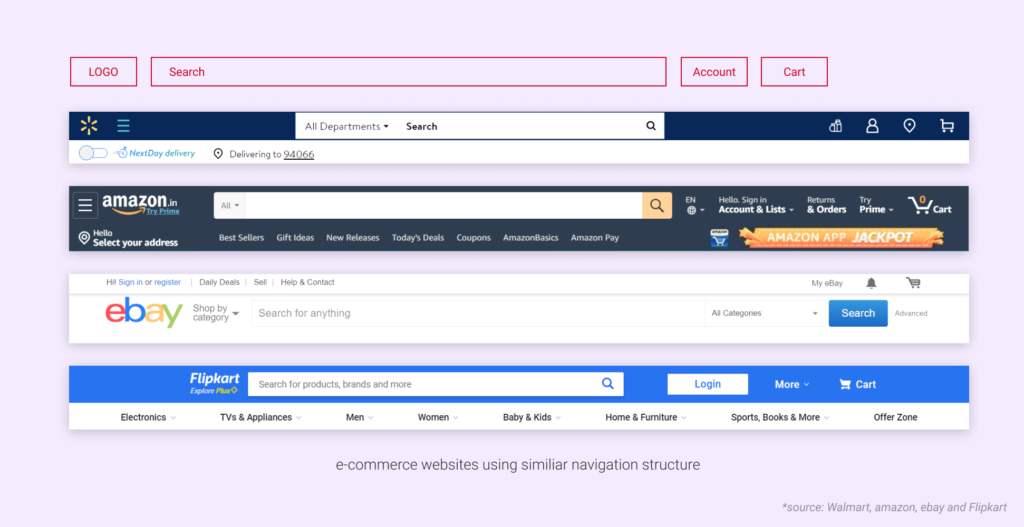
Users spend most of their time on other sites. This means that users prefer your site to work the same way as all the other sites they already know.
Most e-commerce sites work in the same way – the only real difference tends to be in branding. Not so for ZARA. As exemplified above, the way this website works is wildly different to other e-commerce sites.
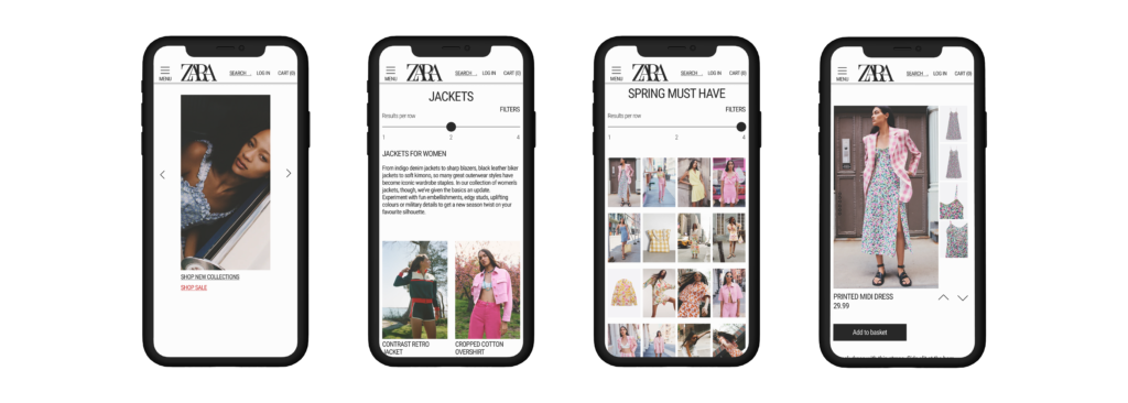
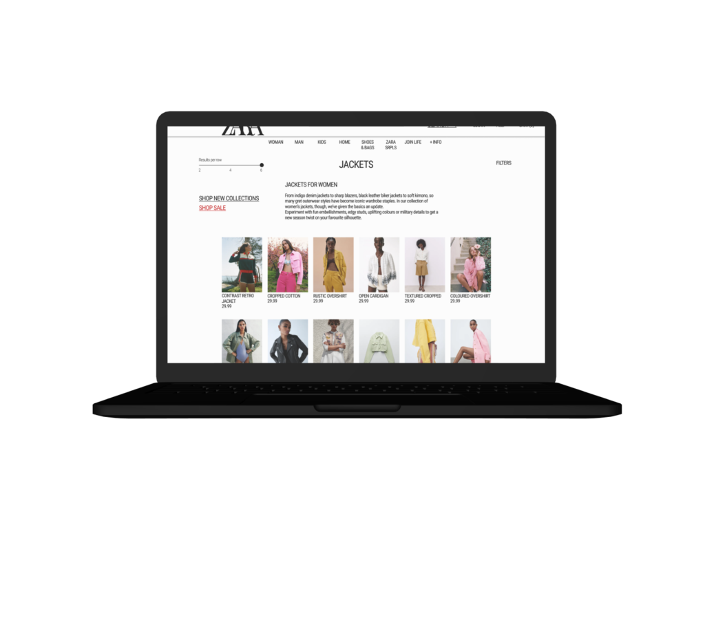
My redesign retains the unique aesthetic of ZARA’s site (one which matches the feel of their physical stores) while making small changes to increase familiarity for users and make them less likely to quit the site out of frustration. For example, I adjusted the product category page layout so that images appear in a uniform manner which is easy to browse, rather than retaining ZARA’s confusing mix of image sizes.
60:30:10 Rule
60: White
30: Black
10: Red
I followed this rule when planning my redesign in order to create a sense of balance and allow the eye of a shopper to move comfortably from one focal point to another. Admittedly, this was not a difficult rule to follow since the ZARA website’s use of colour is minimal.
Following WCAG Guidelines
The original site had multiple accessibility violations which I made note of and fixed in my iterations. They included:
- Making all text readable (all text was above the 16pt minimum for desktop and above the 12pt minimum for mobile)
- Providing captions for multimedia content including symbols and icons (the menu button was not captioned on the original site, causing people to miss it)
- Making content appear and operate in predictable ways (changing the layout of product browsing pages to a more standard, familiar format which reduces user frustration)
- Helping users navigate and find content (suggesting search terms, including links to sale pages)
Prototype
Conclusion
- Focusing on the bigger picture
My main goal with this redesign was to make small UI changes that had a big difference to the UX. I kept the majority of the site the same and made slight changes instead. This meant I didn’t have to spend much time thinking about what the site was going to look like. This allowed me to spend more time considering accessibility.
- What I learned
During this project I struggled to get exactly what I imagined from Figma. I planned some interactions and animations that I couldn’t recreate. This added time to my schedule. In the end, playing around with the animation tools helped me learn to prototype better. I was even able to experiment with different options for interaction design. If I had another time-restricted project, I would plan according to my existing skills.
- Future plans
If I could launch this project, I would retest with similar users. This would prove that my redesign made the site more accessible, intuitive and usable.