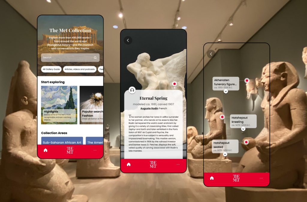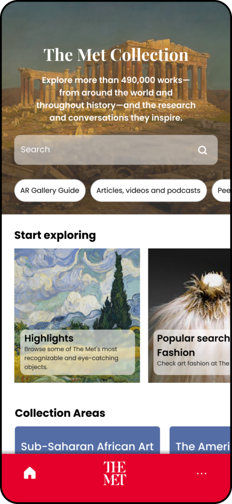
I wanted to create a UI concept for an augmented reality (AR) app that enhances the museum-going experience by providing an interactive, immersive, and personalized guide to the museum’s collection.
The user group I designed for was visitors to the Metropolitan Museum of Art, ranging in age from 18-65, with varying levels of familiarity with art and museums.
The Met is one of the world’s most popular museums, attracting millions of visitors each year. However, navigating the vast and diverse collection can be overwhelming for many visitors, who may not know where to start or what to look for. Traditional audio guides and paper maps can be cumbersome and time-consuming, and do not provide the same level of immersion and interactivity as an AR experience.


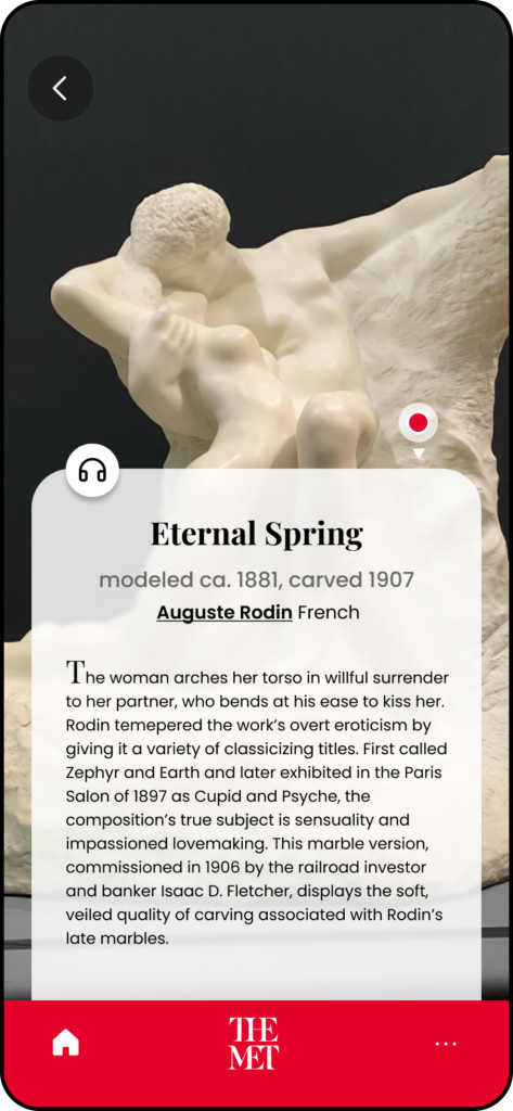
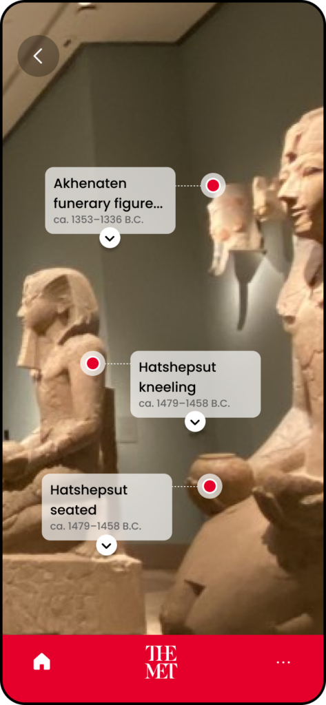
I designed an AR camera view of the museum’s galleries, with markers or boxes that point to specific artworks and provide detailed descriptions when selected. When one of these boxes are tapped, it would open a detailed description of the artwork
If I were to develop the design further, I would include interactive elements such as quizzes and trivia that encourage users to engage with the artworks in a fun and meaningful way. I’d also include personalization options that allow users to create custom lists and save their favorite artworks for later reference.
If this design were to be developed, it could increase user satisfaction and engagement and have the potential to be used by thousands of museum visitors. The app’s search function, personalized lists, and interactive elements could be particularly popular, and the AR camera view of the galleries would provide a unique and immersive experience for users. This could help increase visitor retention and repeat visits to the museum, as users would be able to discover and explore new artworks and areas of the museum that they might not have found otherwise.
Got a question about this design?