A multi-functional app for homeless women
Brief
As part of my course with Love Circular, I was tasked with creating an app for people who are either experiencing homelessness, have just been released from care/prison/hospital, or have moved into new accommodation and need a way to ensure successful local community integration.
3 screens – a homescreen and two other screens of my choosing
Time frame
2 weeks
My role
User researcher & UX/UI designer
Research
Userbase analysis
One of the difficulties involved in this process was being unable to carry out surveys of my target audience. I turned to online resources from news articles and charities such as Crisis to gather information on what difficulties are faced by people experiencing homelessness and the best ways to help them.
Group research
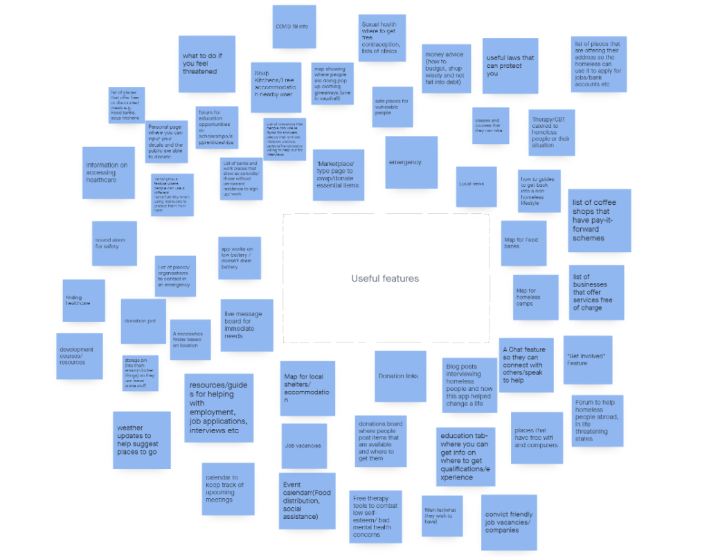
Using InVision, my LoveCircular class laid out two brainstorms to collate our research:
- Problems associated with homelessness
- Useful features
Solo research
Using the collated research, I decided to focus on designing an app which would help homeless women specifically. I was aware of the sensitivity of this topic, and in order to avoid over-simplifying the issues faced by people experiencing homelessness, I watched the BBC Three documentary Girls Living on the Streets of Brighton to hear directly from homeless women about the specific challenges they face.
“That’s why we have to sit in packs of two. If you’re sitting by yourself you will just get targeted and targeted.”
“With a female what you need to remember is that if you look good you feel good.”
“The worst part about being homeless is having no-one.”
Define
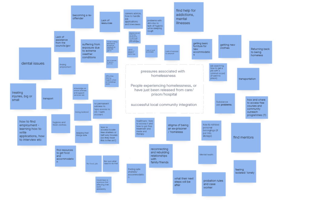
I completed a brainstorm on the problems faced by homeless women in particular.
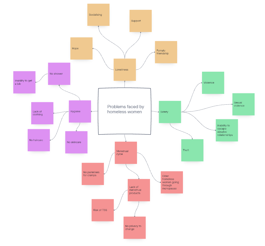
Because the challenges faced by homeless women are numerous, not all of them can be helped by one app. I decided to focus on three main issues:
- Safety
- Hygiene
- Loneliness
Competitor Analysis
While there are no direct competitors to the app I’ve chosen to design, there are three apps which individually relate to the three issues I chose to focus on with my app. The first of these is Samaritan, which deals with helping the homeless through funding for various purposes, including hygiene products.
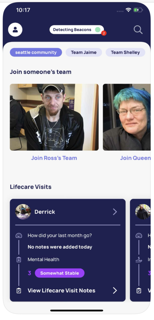
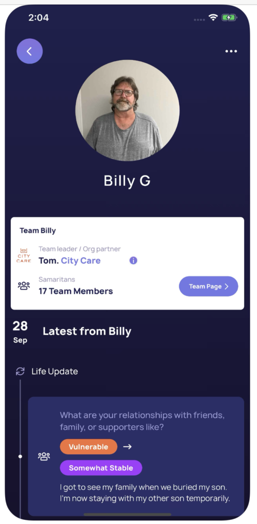
Samaritan equips the homeless with beacons that help locate them within the app. When “Samaritans” walk nearby, they receive a push notification and access to information of the homeless person: their personal story, their goals, and how they can truly help them. You can also donate some money through the app, money that can only be spent towards critical resources at partner stores, including groceries and transportation.
The app has a clean UI, and has multiple user journeys. These include:
- Finding a homeless person to support and joining their ‘team’
- Learning about the person’s life and needs
- Setting up direct debits to the person
- Making one-off donations to linked charities
Samaritan meets the needs of:
- The samaritan: satisfying their desire to help vulnerable people with specific needs
- The homeless: grants them increased visibility and access to help
- Charities: shortens the gap between themselves and the people who require their services
Strengths
- Clean, modern UI
- Offers a range of options for those who want to help
- Easy to navigate
Weaknesses
- Restrictions are placed on where the recipient of donations can spend their funds
- No way of solving delays between time of donation and person receiving it, which is unhelpful when someone needs urgent help
- Forces homeless people to compete with one another and prove they are ‘deserving’ of help
The second app is OneScream, which deals with the problem of women’s safety on the streets.
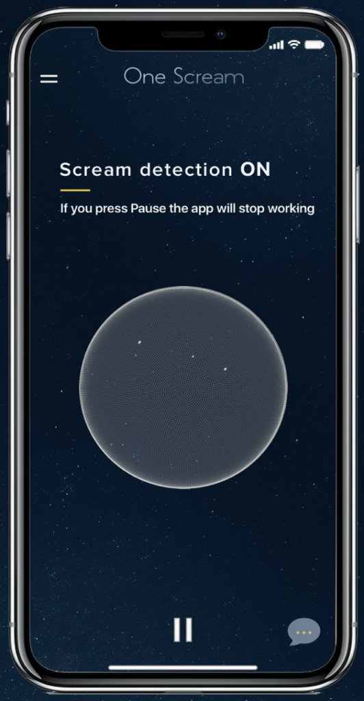
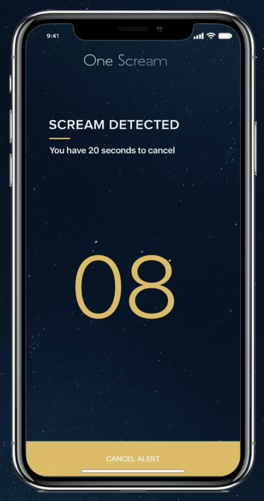
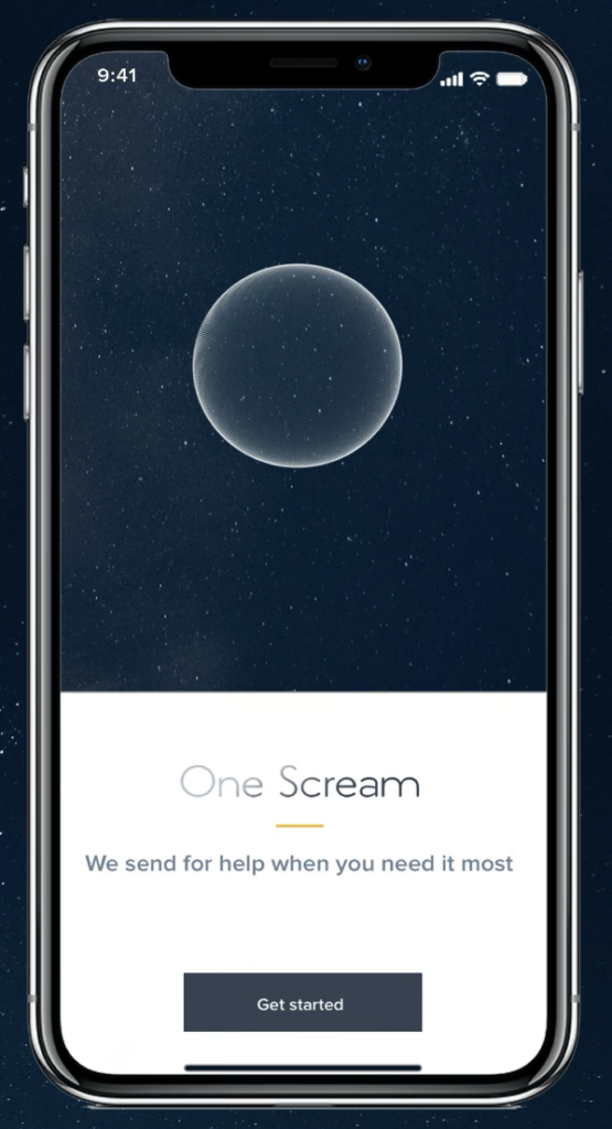
One Scream is a voice-activated personal safety app for women and teenage girls. It is designed for moments of extreme distress, where a woman’s instinctive reaction is to scream. The instinctive panic scream is what triggers the app to identify the user’s location and send help to their loved ones.
The app has a simple interface since it has only one function. The user journeys surrounding this function include:
- Setting up emergency contacts
- ‘Scream test’ page

One Scream meets the needs of:
- Women and teenage girls worried about their own safety
- Friends and family who are concerned about the safety of their female friends or family
Strengths
- Simple navigation
- Unique premise
- Low onboarding
Weaknesses
- Many users unconfident that the app will detect their screams
- Limited number of contacts can be added
- Could offer more functions like contacting emergency services as well as friends/family
The third app is Bumble BFF, which deals with the problem of loneliness.

Commonly known as a dating app, Bumble also has a friend-finding feature called BFF, which uses the same swiping and matching algorithms for friendship instead of dating. After switching into BFF mode, users will see their potential dates replaced by people of the same sex that Bumble thinks you would want to be friends with. Once both people swipe right, both parties have 24 hours to initiate a conversation.
Despite the multiple functions, Bumble’s interface is clear and well-organised. The user journeys include:
- Browsing the suggested profiles for matches
- Editing your own profile with bio and images
- Making a match
- Initiating conversations with the match
Bumble BFF meets the needs of:
- Adults looking for new platonic relationships
- People who have moved to a new place and are looking to make connections
Strengths
- Uses a familiar interface but for a different, well-identified purpose
- Takes away some of the effort and awkwardness out of making new friends
- Strong UI
Weaknesses
- Algorithm removes possibility of random, unexpected friendships by only showing matches it thinks the user is ‘compatible’ with
- Time limit can be restrictive to busy people
- Reviews suggest connections fizzle out quickly, since the app does not offer incentives to continue conversations
User persona
Who is she?
Tracey is a 36-year old woman who has been homeless for most of her adult-life. Unable to find a job due to a mixture of mental health issues and learning difficulties but not qualifying for government benefits either, Tracey has been unable to pay for a home.
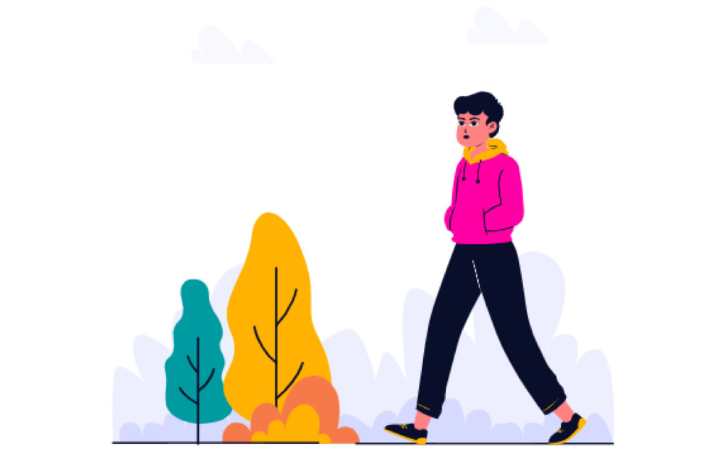
What’s happened?
Tracey is forced to sleep rough, moving between sofa surfing, an odd night in a hostel, and the streets. She’s applied for a room with an organisation that helps people like her, but with high demand and a lengthy process, the wait is long.

What problems is she having?
Tracey’s biggest concern is safety. She is often at risk of both physical and sexual violence, as well as theft. Another problem is hygiene. Without a home of her own, Tracey doesn’t have continuous access to a shower or toilet – this is particularly difficult during her menstrual cycle. On top of all this, Tracey also has to deal with the loneliness that comes with not having a fixed home.
Ideate
Feature map

I drew a map to lay out the key features to be included in the app, as well planning out visual elements including the colour scheme and styling.
Design
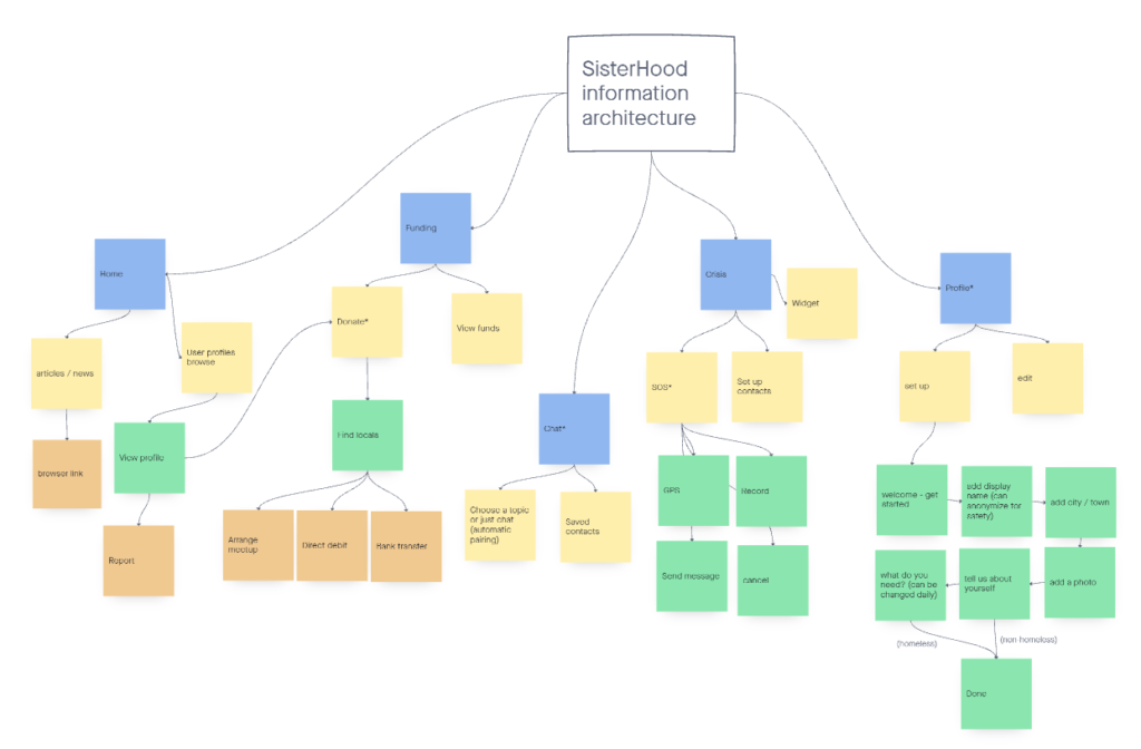
Information Architecture
While I could have included more features that might be useful to people experiencing homelessness, I have kept a cap on the number of features in order to ensure the app is easy to navigate, not overloaded with functionalities.
Figuring out the information architecture was a learning curve for me, as there were various options in which the pages could have been organised. I decided to go with a navigation bar at the bottom of the screen.
Wireframes

Low-fidelity
One challenge with these low-fidelity wireframes was designing alternate screens for homeless and non-homeless users. This involved deciding what information would be a priority for each user.
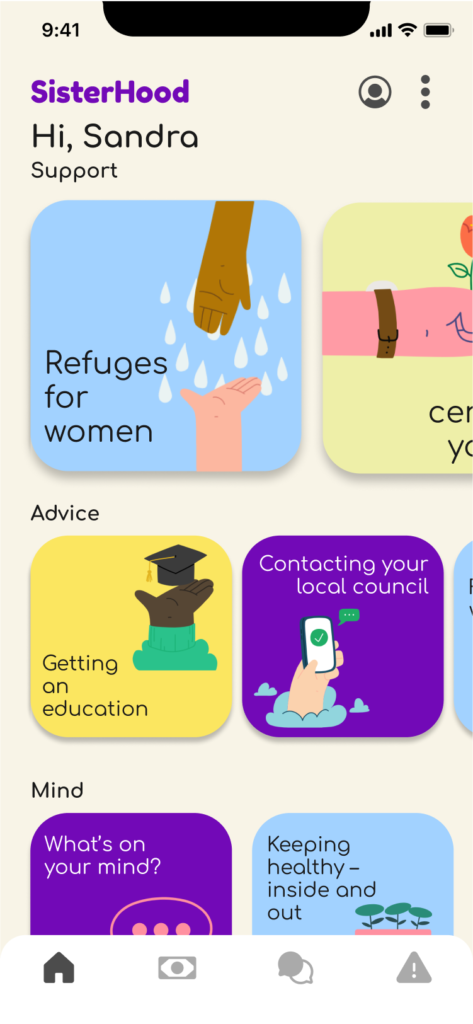
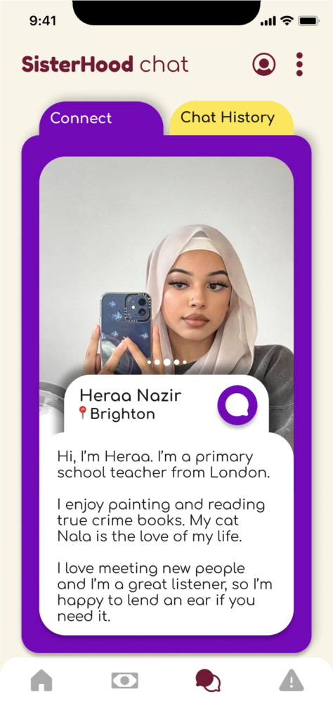
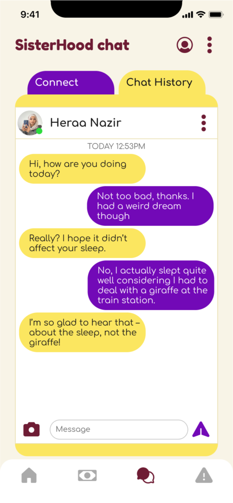
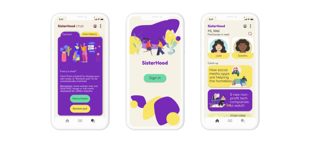
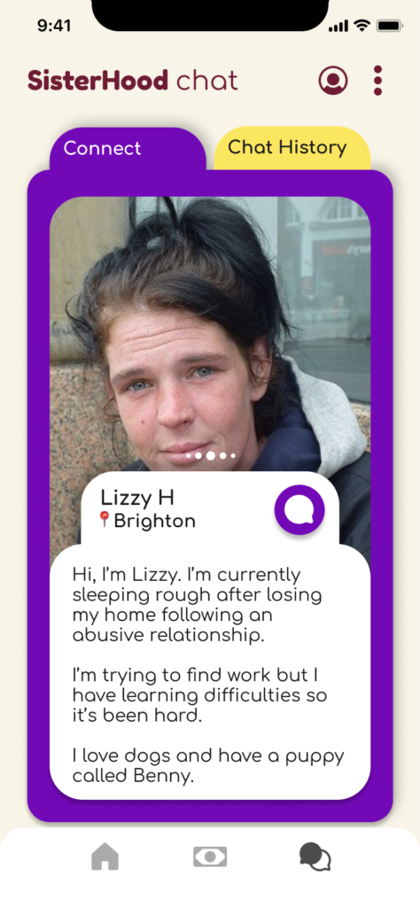
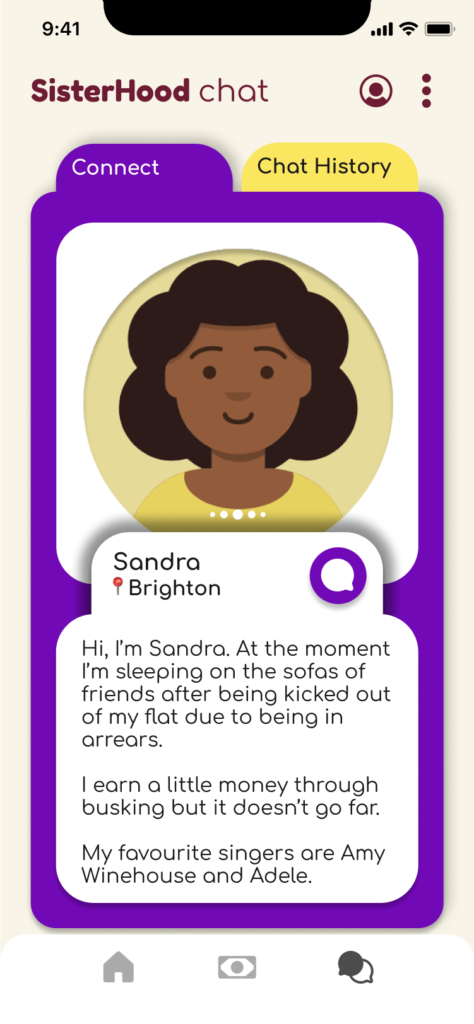
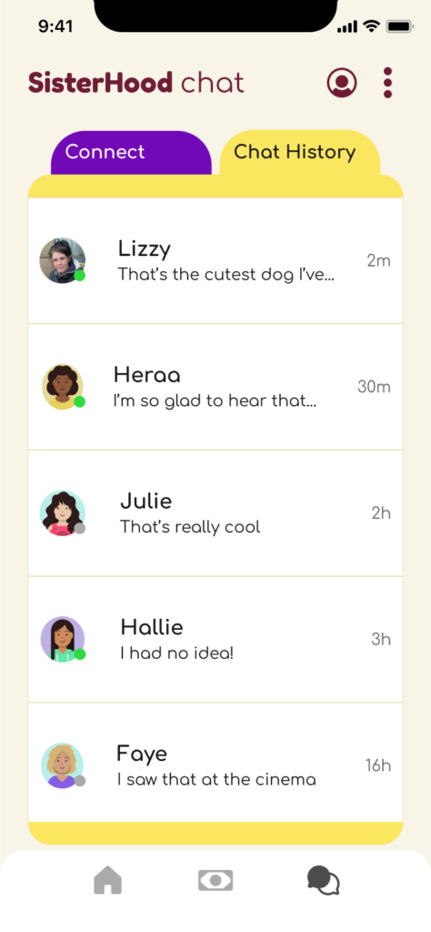
The app would have four main screens which correspond with each of the issues I chose to focus on: Home, Funding, Chat, and Crisis.
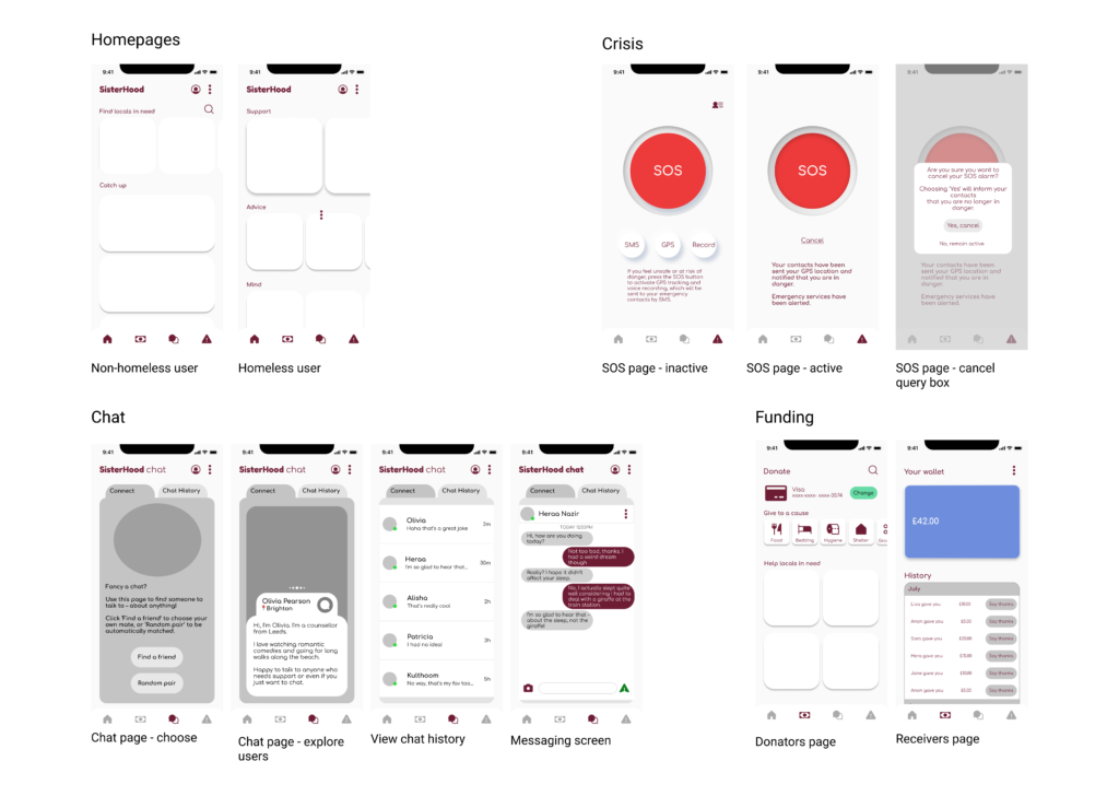
High-fidelity
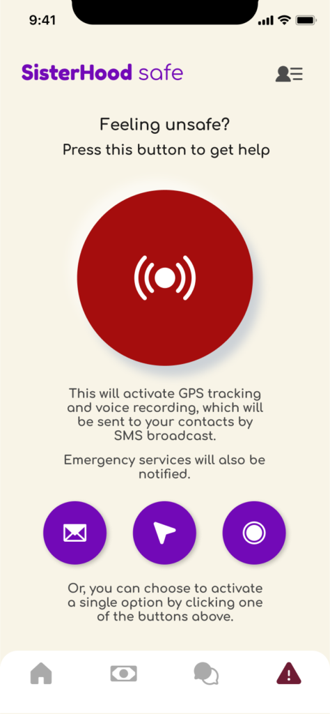
I decided to omit the SOS page from the non-homeless user’s version of the app, not only because they might have less use for it than a homeless user, but also because the ‘safety’ portion of the app was included to solve issues for homeless women in particular.
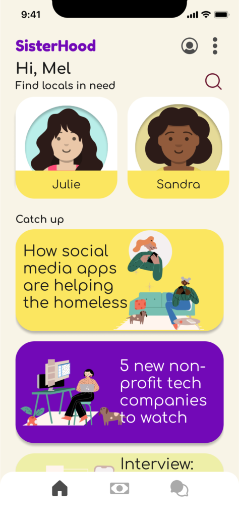
The Home page would have links to advice and support for the homeless user, while the non-homeless user would see prompts to connect with women in need as well as relevant articles.
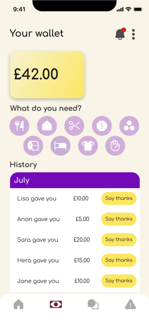
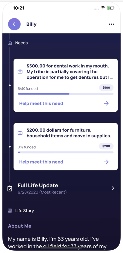
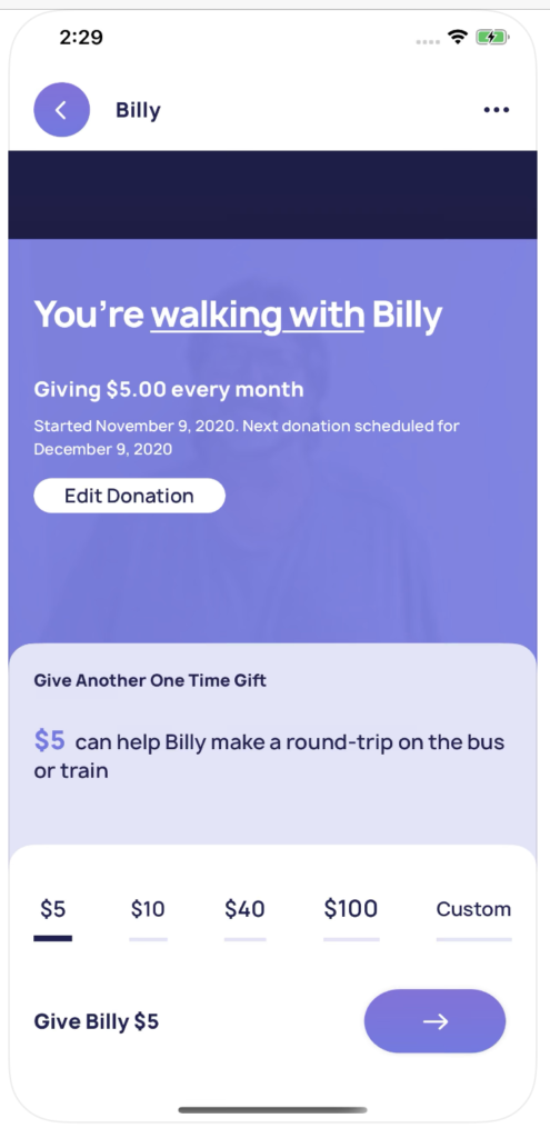
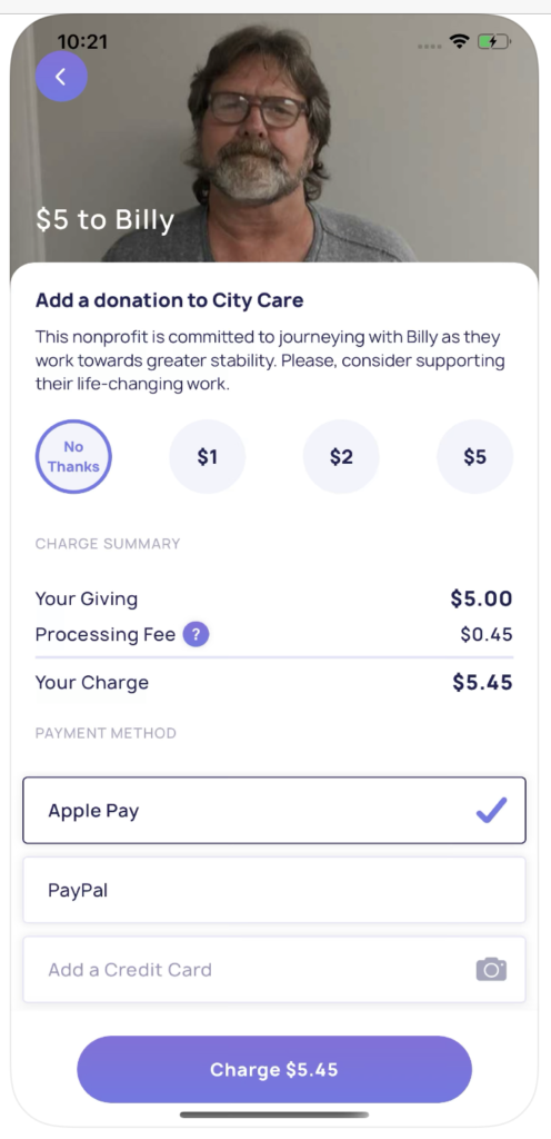
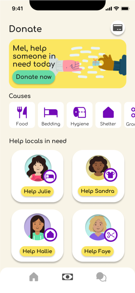
The Funding page would allow a donor to choose a category to donate towards, or choose a local woman to help out. For the receiver, she would see how much has been donated to her.
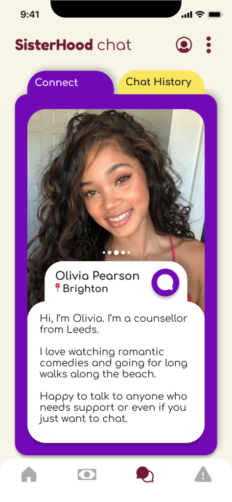
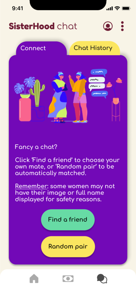
The Chat screen works similarly to Bumble BFF, but includes two routes – swiping through the list of profiles yourself or being paired up randomly.
Finally, the Crisis page is simple to avoid distraction and confusion for people for people who need to use it. A large SOS button dominates the screen, with a short text explaining what it does.
Final Designs
Helper view
Receiver view